
A cohesive icon font and design system.
From designing icons to implementation, ensuring that each icon aligned with the company’s growing design system.
Company
Promethean
My Roles
Lead designer
Stakeholders
Designers, developers and product managers, branding and marketing, end users

It was for the user.
Most importantly, icons were for the user. The main focus was to improve clarity, enhance navigation, and foster an intuitive experience.

Collaboration was essential.
I worked closely with cross-functional teams and members including designers, project managers and developers to meet the needs of product teams.
Consistency was key.
Adhering to a strict set of principles allowed for greater usability and a cohesive experience across web, hardware and software experiences.
My roles.
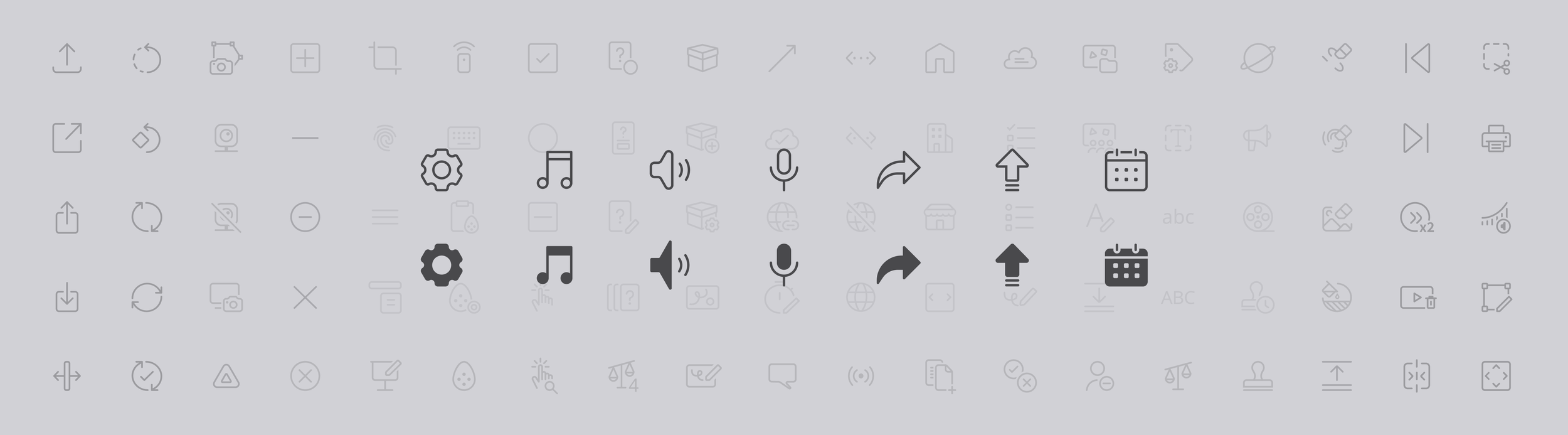
Maintained and updated the icon font that grew to over 1022 icons.
Owned the process from gathering and designing new icons, vetting their compliance to the rules and generating the new font for developers.
Oversaw and provided feedback across verticals for all new icons created.
Responsible for communicating all changes and updates to all teams.

Challenges.
Clarity: Icons needed to help users with instant recognition and impactful simplicity.
Scalability: Icons were used on multiple platforms.
Localization: The icons needed to be recognizable across different languages and cultures.
Collaboration and consistency: The icon font was used with multiple products and teams. It needed to meet different needs throughout the company.
Collaboration.
Getting icons into multiple products required coordination with several teams all with their own product managers, engineers and stakeholders. In collaboration with the product manager that owned the design system, I proposed a regular release schedule for the icon font to manage working across verticals a more seamless process.
The process from receiving or designing icons, revising them, getting approval across the design team, and implementation of the icon font required ongoing collaboration with designers, product managers and engineers.
Icon stats.
15%
growth in one year.
1022
total icons.
82%
company-wide adoption.
So what?
Growth of the icon font - showed products were growing in scope and the font was an essential part of the user experience
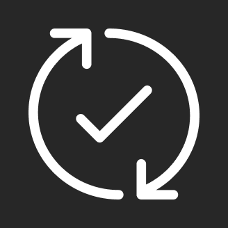
More icons in this font meant page load times decreased (happy devs!)
Only 82% company-wide adoption? The design system was strategically adopted for products that were not already established and would continue to be updated in the future. The icon font was part of the driving force for moving this company’s products design and branding forward.
The Icon Font.


There’s more.
There’s a lot more to this story that what I’ve been able to share here. Please contact me and I’d love to share the full story.