

A better reflection of the company.
The website was out of date, branding did not reflect the reputable physiotherapy clinic, and most importantly the site did not meet patients needs. I re-designed the website from the ground up with both the clinicians and patients in mind.
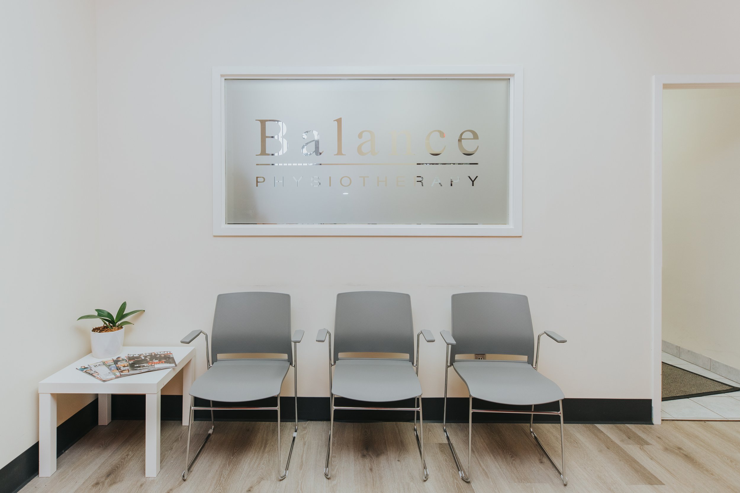
Client
Balance Physiotherapy
Timeline
8 weeks
My Roles
User research, UX/UI design, brand identity, design implementation
Website re-design approach.
The original website was rigid, clinical, and unintuitive to navigate. There was little direction for the user and the amount of information on the home page was overwhelming. Users would spend most of their time scrolling, looking for information rather than finding what they needed. The website used stock images rather than representing the great people that came through the doors and worked at the clinic.
Patients and their families were coming to this site when they were at their most vulnerable. I wanted provide them an experience that would be reflective of the kind of thoughtful service they would receive at Balance Physiotherapy.
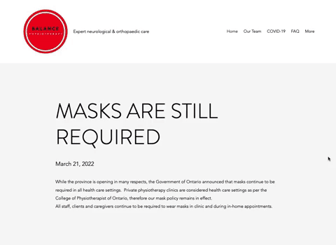
This was their website before.
The process.

This is Andrea. Her father recently had a stroke and she's looking for a clinic in the area to get him the best help possible. She's a busy woman so the faster she can get valuable information, the better. She's coming to the site during one of the most vulnerable times in her life. I created multiple personas to gain a better understanding of what kind of users would be coming to the site.
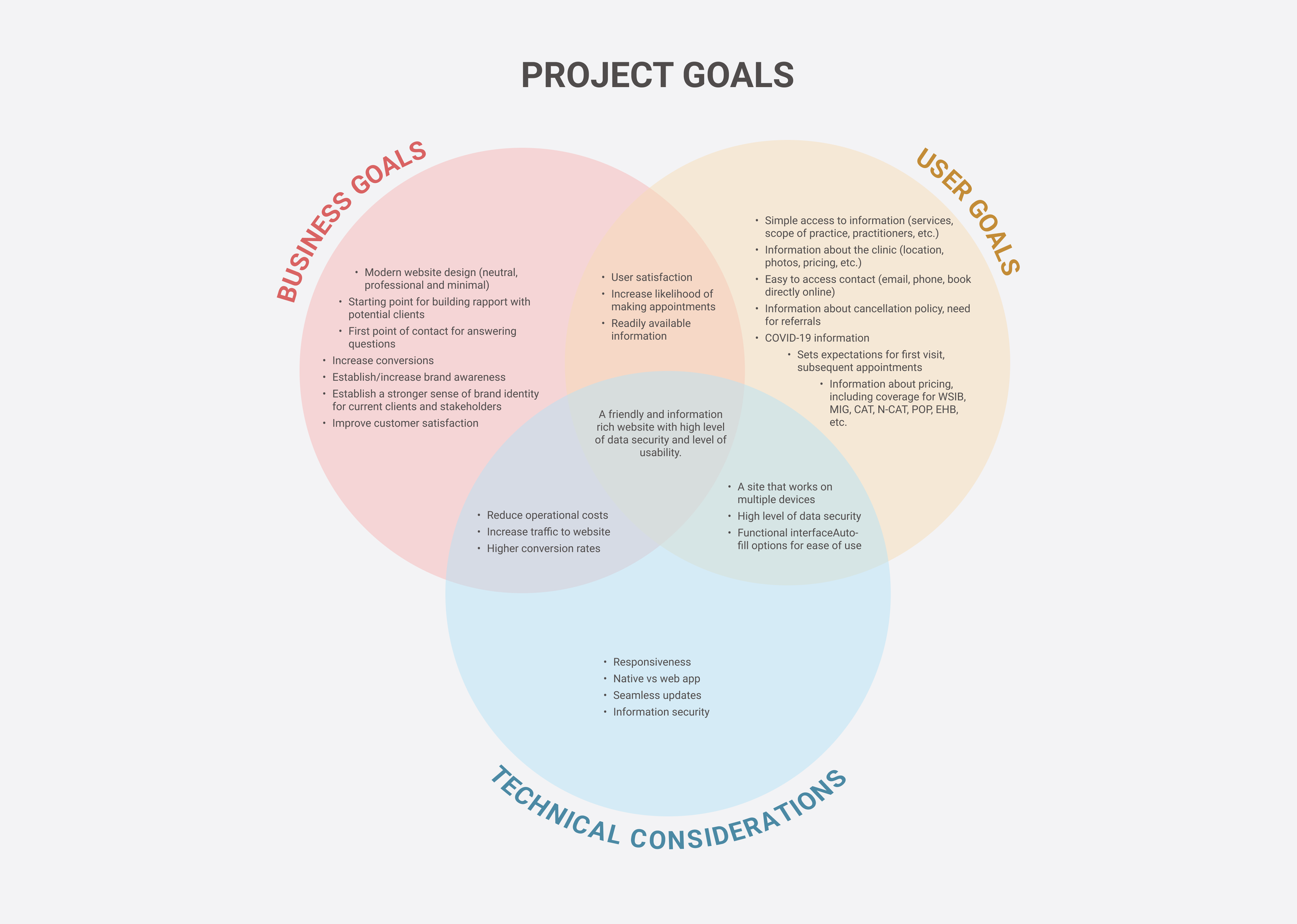
The project goal was finding a balance between business and user goals with technical constraints. At the end of the day, creating a positive user experience was the highest priority.
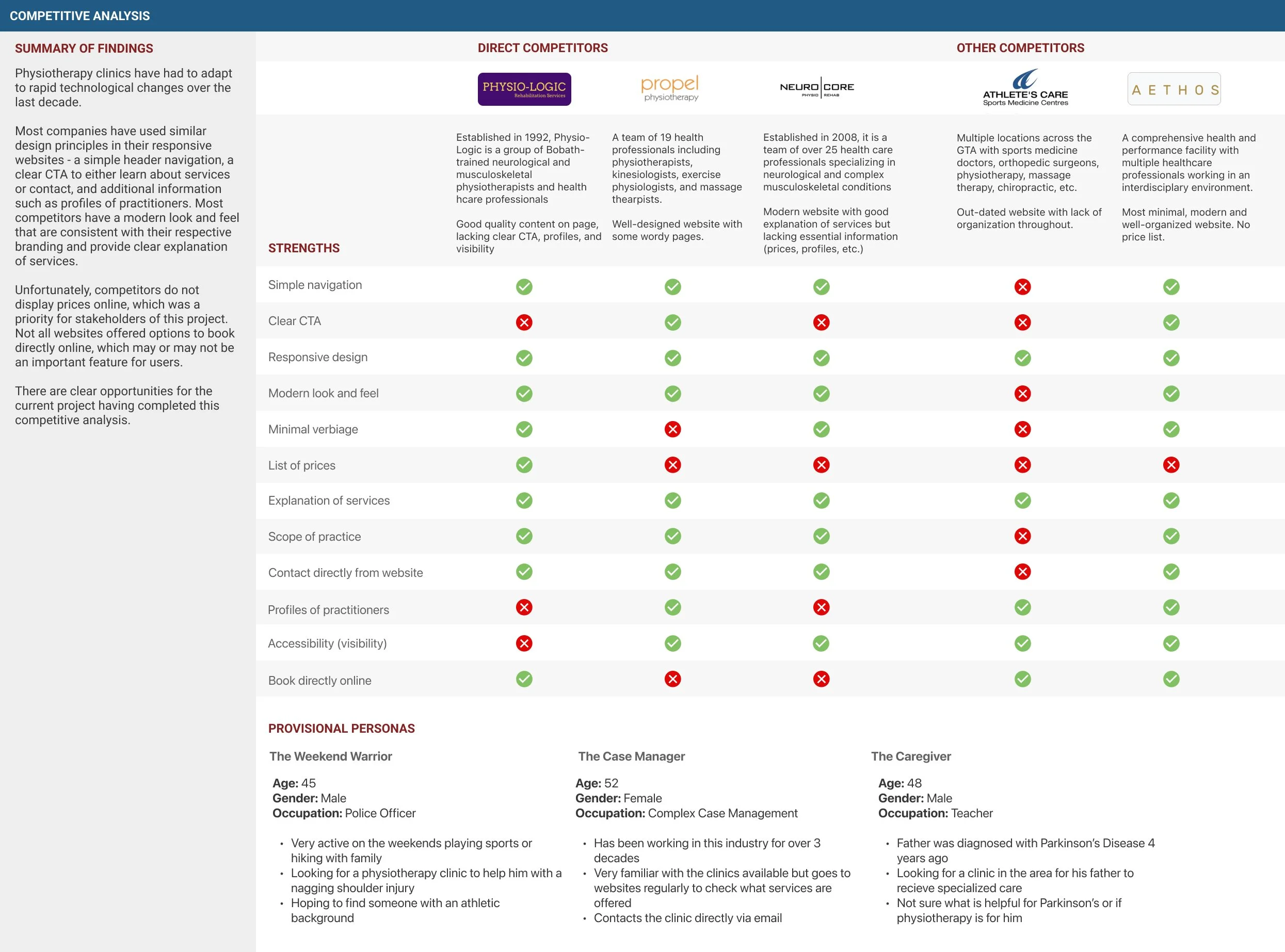
Several local physiotherapy companies had websites as well. Some websites met certain user needs well but there were many opportunities for me to make a larger impact with this new site.

Information architecture (in discovery). I found the organization of information to be very heavy on the homepage. This is what resulted in lots of scrolling and provided a frustrating experience for patients looking for information.

Information architecture (after re-design). I wanted to create an intuitive experience for users. Information was organized through multiple card sorting exercises during user research and this method proved to be easier to navigate.
Branding.
After having a better understanding of the users' needs, I looked at branding - it was the voice that was needed to represent this company. I wanted this site to evoke a sense of calm, professionalism, and care.
This branding would be used across the company - from business cards and pamphlets to letterheads and community sponsored events.
In collaboration with the clinic owners, the branding went through several iterations before the new website went live.

The solution.

The home page - "welcome, we're happy you're here!" More than anything, I wanted patients and their families to feel a sense of calm. They were at this site because they were in need of help. Based on my research, most users were there to learn more about what the clinic offered - so I put that front and centre.
The website was fully responsive. Sometimes, patients and their families were accessing the site when they were on the go. For others, they primarily accessed websites from their mobile phones for its accessibility features. It was important that everyone was given the same user experience.
I wanted the people of Balance Physiotherapy to be the backbone of this website. They are the ones patients would be entrusting with their therapy. I did away with the stock images and made sure patients and their families would see and feel who makes Balance Physiotherapy so great.
The clinic specializes in helping people with neurological conditions - brain injuries, spinal cord injuries and Parkinson's Disease just to make a few. I knew patients and their families needed to know about accessibility at the clinic so I made a dedicated page to provide them with this information.Success measured.
20%
increase in bookings made after clients visited the website.
300%
reduction in time spent scrolling to find information.
ALL
users interviewed reported the new design was a significant improvement.
I still wasn’t satisfied.
In my past life as a physiotherapist, I had worked with hundreds of patients who came in to the clinic and just didn’t know what to expect. I wanted to find a way to answer their questions and ease any uncertainties before they even stepped into the office.
What does a session look like? What happens during an assessment? How often will I come for physio? How much does all of this cost?
What does a session look like? What happens during an assessment? How often will I come for physio? How much does all of this cost?
Patients deserve absolute transparency.
This was the key.
I took my personal experiences and put together a tangible solution. Rate transparency and a “What to expect” section not only helped patients but also allowed clinicians to use more of their valuable time on treatment.
This is the kind of thoughtfulness and consideration that is reflective of the incredible people that work and are patients at Balance Physiotherapy. The clinicians and patients deserved nothing less.

Note: Try to find the the little bouncy ball easter egg! That was fun to design.